Theraply
A marketplace that helps connect people with the right therapist.
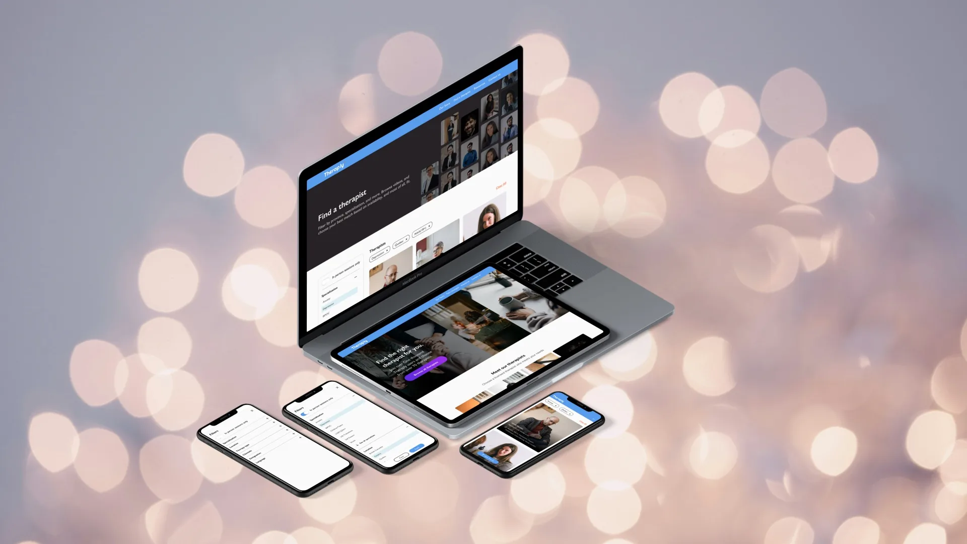
Theraply is a marketplace that helps connect people with the right therapist, the first time. I led the redesign of the website along with a team of five, including the founder, developer, content manager, and another designer. The project engagement included designing the style guide, in-depth filtering capabilities, and improvement of the overall user experience.
The problem
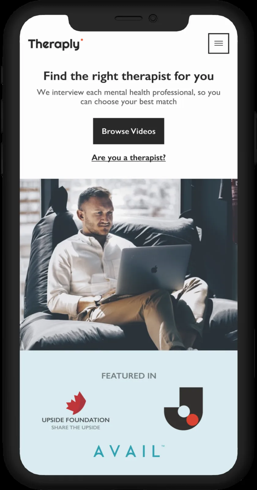
The goal was to get users to book sessions with therapists. Since the previous design was not built for scale, adding more therapists to the platform was making it increasingly difficult for users to refine their search. Furthermore, users felt that the visual design of the website felt too 'clinical'; they wanted the website to feel uplifting and calming.
The solution
We gave users more in-depth filtering capabilities so they could discover therapists tailored to their specific needs. Information hierarchy was restructured to make finding and booking a therapist more accessible. We also completely rebranded the website and created brand guidelines that helped ensure consistency across all available channels.
Finding the right therapist, the first time
Despite the growing awareness of its benefits, there is still a negative stigma attached that causes some people to feel hesitant about giving therapy a try. With Theraply, we believe that concerns surrounding therapy shouldn't deter you from taking an empowering step forward in life. Whereas many therapy-based platforms are devoid of empathy, every therapist on the platform is vetted. The platform is focused on the long-term relationship between you and your therapist. Though there are many different types of therapist designations, for simplicity I use the term 'therapist' to represent all of them.
Picking up the pieces
Initially, it was important to understand where the existing website fell short of user expectations. Beyond feedback that the visual interface felt too 'clinical,' users wanted increased personalization to make finding a relevant therapist simpler. In addition to interviews and surveys, we felt it was important to build a diverse community of clients for ongoing user research. One of the first steps was sending a follow-up survey to every client who had attended a session; for those who expressed further interest, we facilitated remote usability testing or user interviews. This continuous feedback loop allowed us to iterate faster and focus on the features most important to users.
Survey responses, user interviews, and usability testing revealed a number of critical problems with the site design.
Lack of emotion and personalization
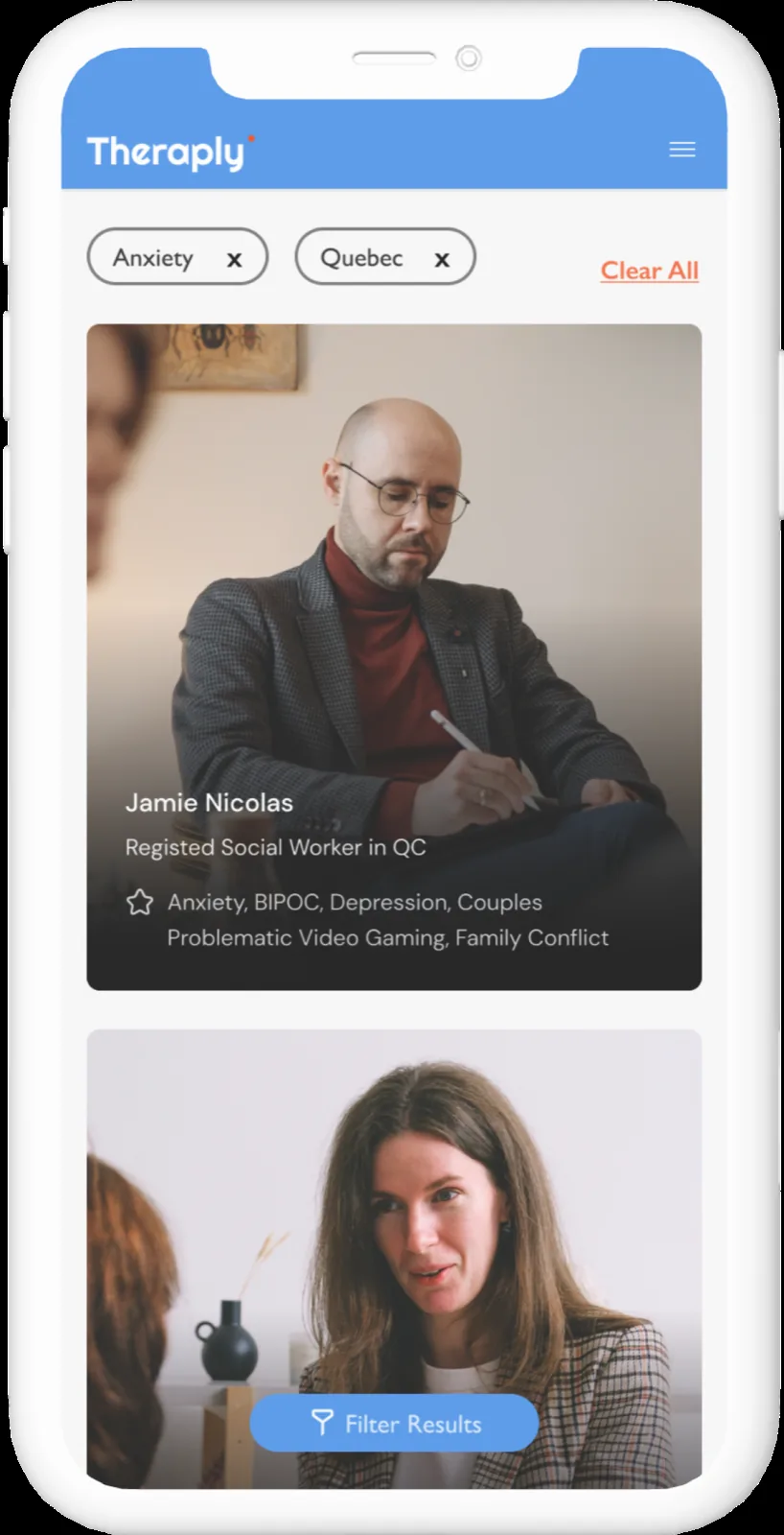
The previous Theraply website felt inherently transactional and unemotional. The colours and branding did not delight the user, resulting in a forgettable experience. From a business perspective, the less memorable the site is, the less chance of people telling their friends and family about it, and for Theraply, word-of-mouth is the most effective form of marketing. Search filters were limited to specialty and location, leaving users scanning through dozens of therapist profiles before finding the one they liked.
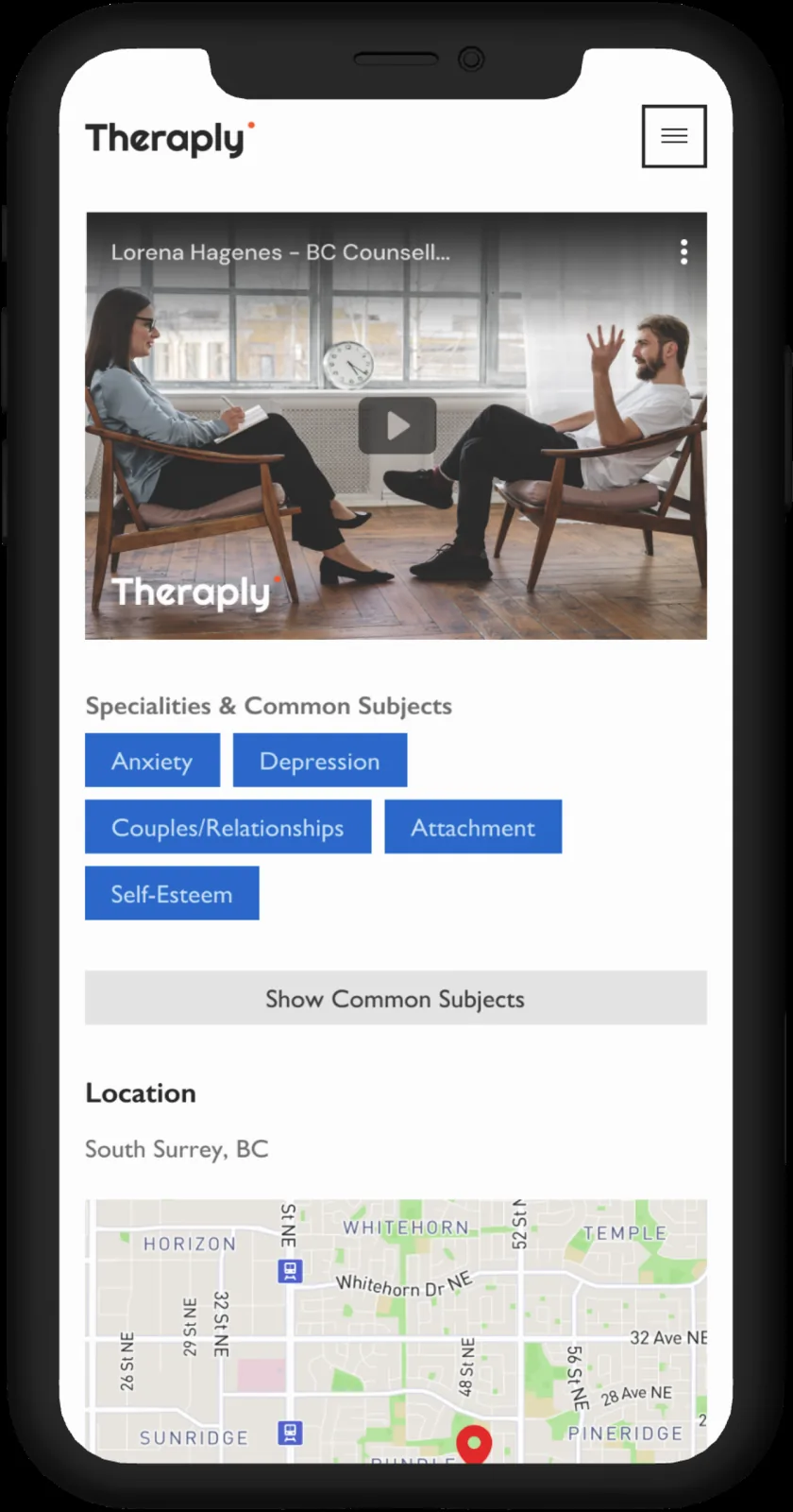
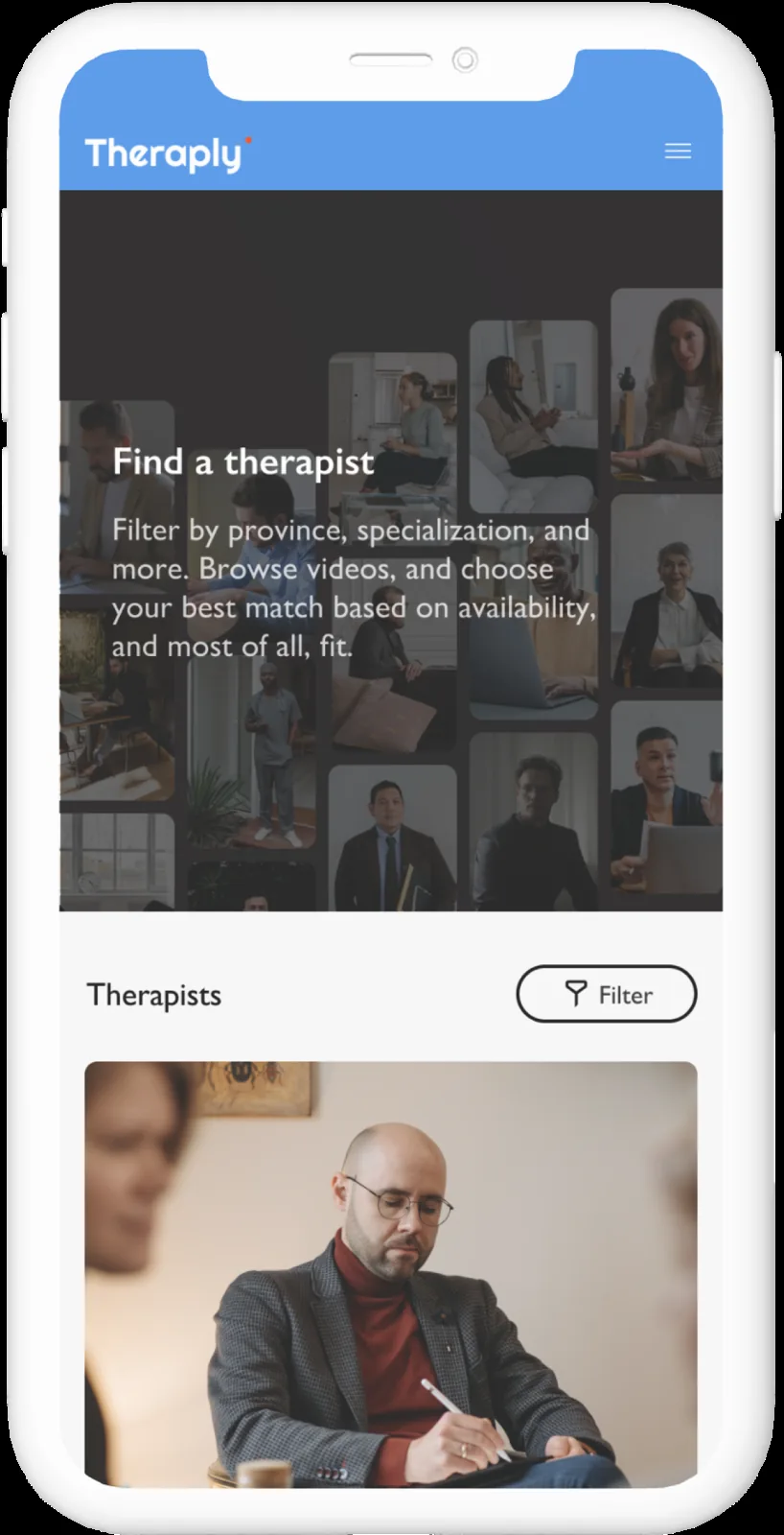
An initial audit with users showed that users were confused by 'browse videos' and how that would aid in their search.
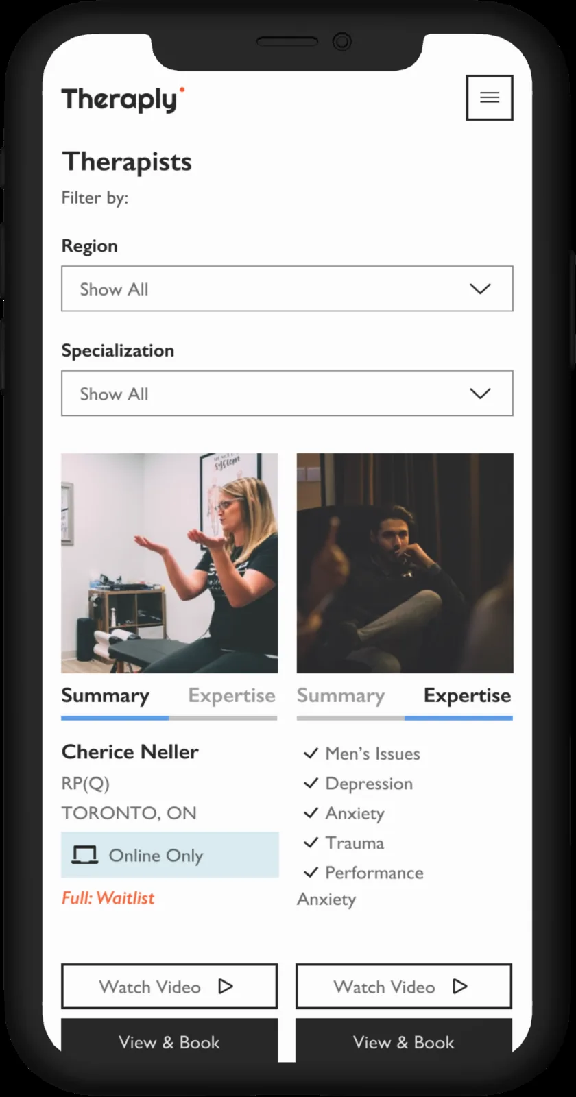
Users felt there was too much information to focus on and were unaware that 'expertise' was a separate tab. While scrolling on individual therapist profile pages, users felt the 'book now' call-to-action was not visible.
Understanding uncertainty
Talking to clients allowed us to better understand problematic moments throughout their booking experience. When trying to personalize their experience with filters (only specialization and location were available on the old site), there were still too many options, leaving them frustrated after sifting through multiple profiles.
Many also reported they didn't know the next steps after booking, so, working with the Marketing Consultant, we created automated emails with next steps and relevant articles about therapy.
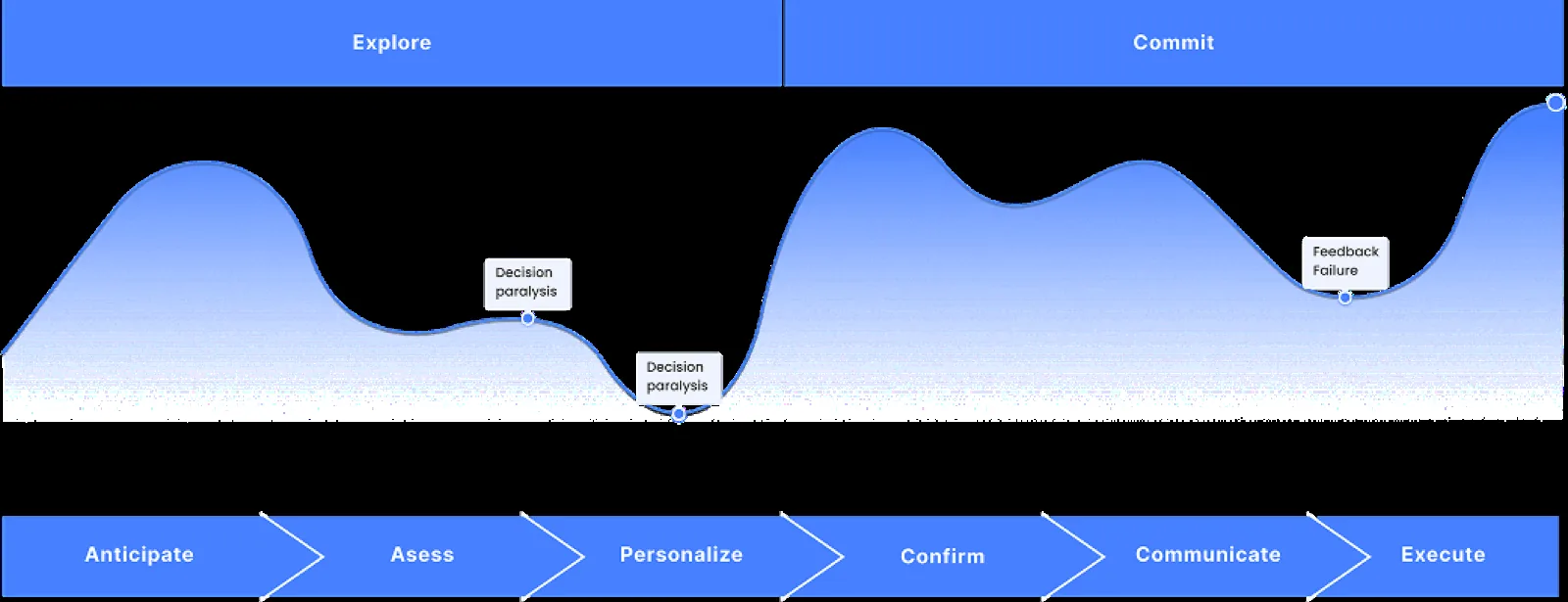
It wasn't enough to simply understand the client journey. I wanted to understand the different factors affecting their booking experience, so I used the spectrums and situations framework adopted from Simon Pan's Uber case study (with his permission). This framework was an easily digestible way to organize and illustrate contexts and was pivotal in creating a more inclusive design.
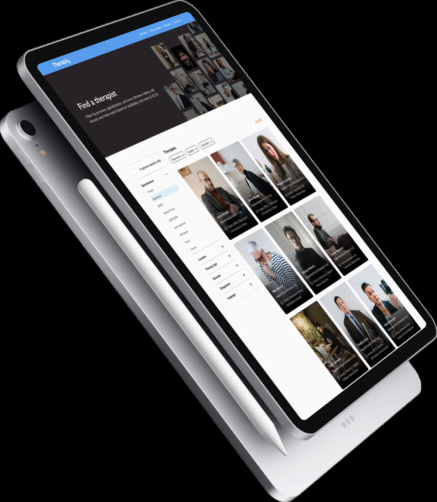
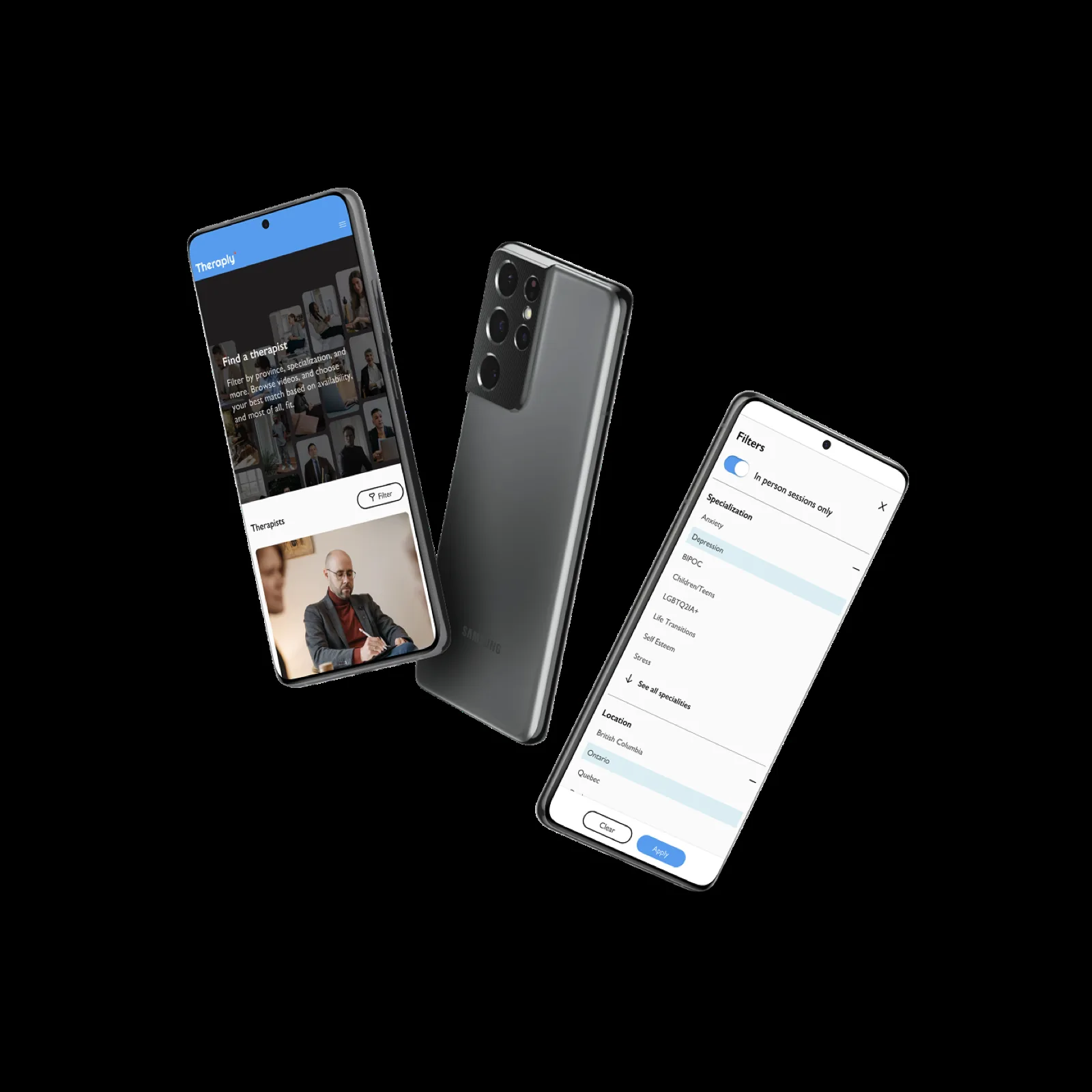
Filtering made easy
Unlike the original website, which only allowed filtering by specialty and location, a more robust, multi-variable filtering system was added to prevent users from visiting profiles that weren't relevant to their goals. There were many challenges with filtering that we had to overcome beyond just their visual design.
Initially we intended to let users select as many filters as they pleased, but testing revealed our supply of therapists wasn't large enough; the journey frequently ended in 'no results found.' To prevent this, we restricted users to one filter per category until we could add enough therapists to the database.
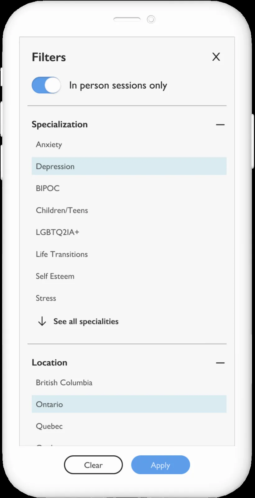
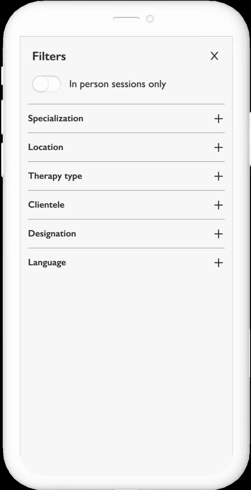
This process was highly data-informed. We collaborated closely with our analytics consultant and therapist advisor to determine which filters to focus on, their order, and how to name each one. It was also important to ensure filtering was easily usable on mobile, as that format accounts for over 80% of the platform's traffic.
An emphasis on content
Our quantitative data suggested that 87.7% of users felt personality fit was the most crucial factor when choosing a therapist. This corroborated our interview insights, where users felt therapist videos helped them understand whether they would be suited to a particular therapist.
With this in mind, we dedicated the homepage to video content, and I worked with the content team to create a hero video showcasing the diverse range of therapists. Our focus on content was also strategic from a business perspective, as we plan to find creative ways to monetize videos in the future.
Modernizing therapy
The age group most likely to visit the website was 25 to 34, so we wanted to ensure the interface aligned with their mental model (applications such as Instagram and Tinder). Our choice of non-traditional colours, relative to other healthcare websites that typically use green, was well-received, with many users reporting that the soft, muted colours felt uplifting and calming. However, this palette did not come without challenges, as we faced multiple accessibility issues early on.
I also worked closely with the Marketing and Content teams to implement the new brand guidelines and achieve brand consistency in a multi-channel environment. The Instagram and YouTube pages are examples of how we successfully created a unified brand.
Disagree and commit
Throughout this process there were instances where features users wanted, or where I advocated for an evidence-based approach, could not be implemented or were rejected by stakeholders. The decision to exclude search capabilities and client testimonials is one example. Search went beyond the project budget, and testimonials raised unresolved questions about negative reviews and regulatory hurdles (each province or state where Theraply was available had different rules about 'promoting' therapists).
Personally, I disagreed. I felt search would personalize the experience further and testimonials would add credibility. Yet to release the redesign without further delay, it was important to commit and move forward. Both features are planned for future updates.
Reflection
Since launch there have been many small and large-scale changes that helped us continuously improve conversions. Our analytics showed which therapists receive fewer page views and bookings, and we began A/B testing profile pictures to increase click-through and conversion.
We also created a separate landing page to guide people on how to find a therapist, providing clarity for those seeking therapy for the first time and addressing concerns that may be preventing them from seeking help.
There's still a lot to improve on Theraply's website, and over time our analytics will help us make better data-informed decisions, but I'm proud of everything we've learned so far, and I look forward to making more improvements.