Fig
A platform for tax calculation and wealth management.
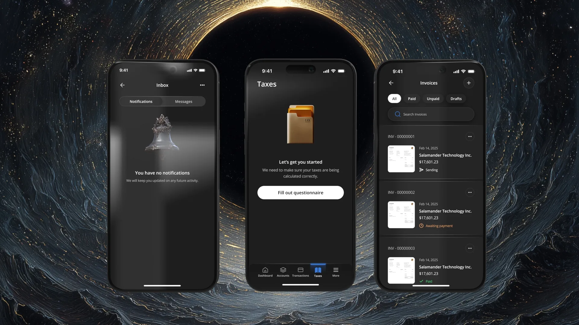
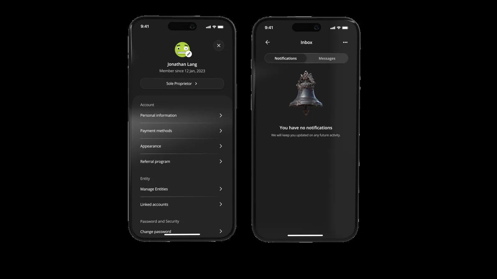
Fig is a financial platform designed to help solopreneurs and freelancers track expenses, accurately calculate taxes, and manage their wealth. Originally conceived as a web-based platform that never saw a public release, I was brought on as the Design Lead to determine the product's future. My evaluation of the market and user behaviors led to a strategic pivot: launching a mobile-first MVP to penetrate the market quickly. I worked alongside a team of four developers, an Engineering Lead, the Chief Wealth Officer, and the CEO to bring this product to life.
The problem
Self-employment comes with a specific kind of anxiety: the terror of the IRS. Users were terrified of underpaying taxes and facing audits, but they also lacked a centralized tool to view their real-time earnings. Existing solutions were either too complex (desktop-heavy accounting software) or too simple (basic expense trackers). Users needed a way to turn tax planning into a tool for active wealth management, rather than just a year-end compliance burden.
The core problem was not 'tax filing.' It was ongoing misalignment between income, expenses, obligations, and long-term planning. Users needed a few things:
- Real-time tax liability estimates tailored to their tax schedule
- A clean record of deductible transactions
- Guidance on reducing liability and using those savings to build wealth
- A tool priced far below CPA services
The solution
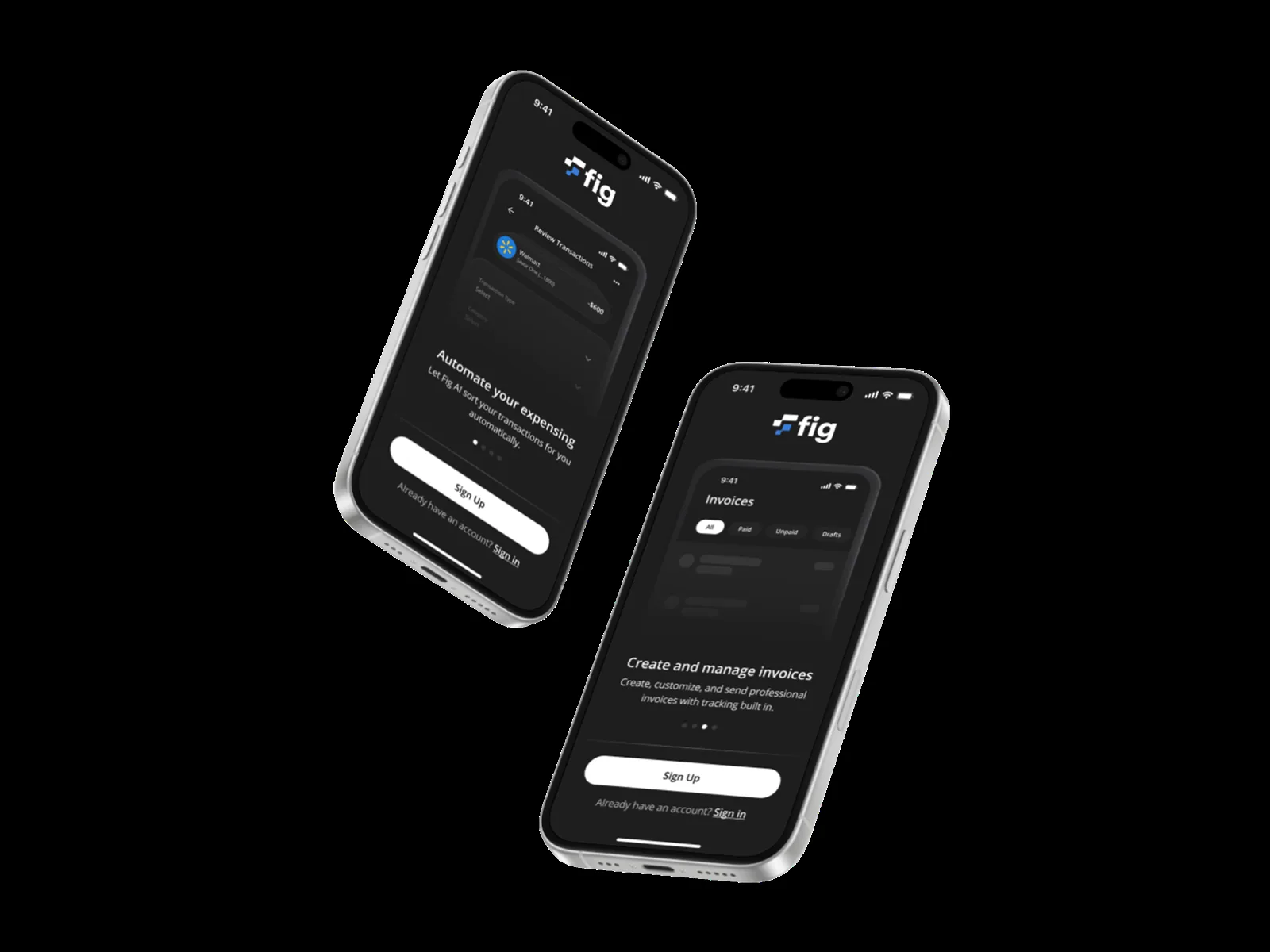
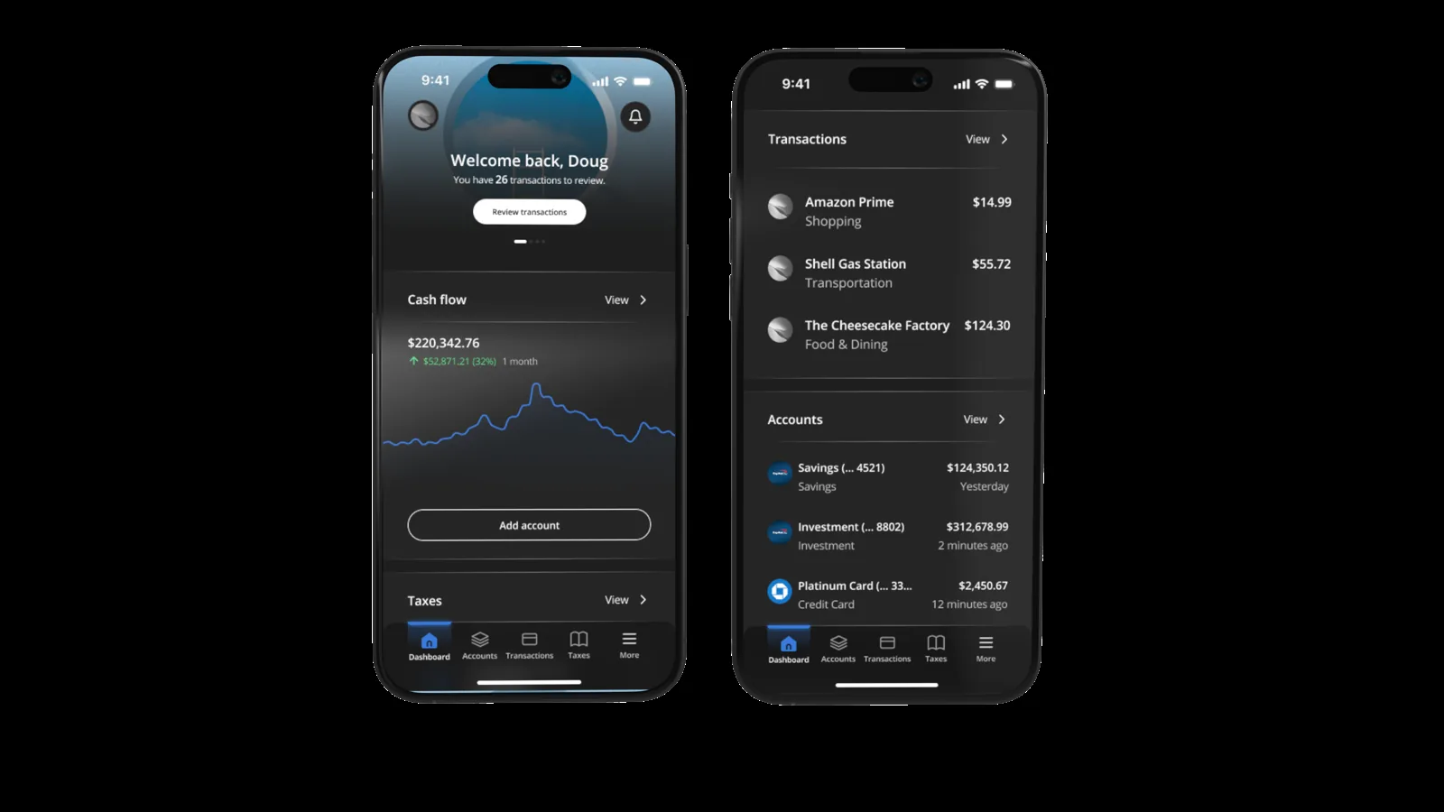
We pivoted from a heavy web interface to a streamlined mobile application. This allowed users to categorize expenses in real-time (reducing the 'shoebox of receipts' panic). We introduced a 'Cash Flow' centric dashboard that visually accounts for taxes before showing the user their spendable income, and a dedicated Tax tab that offers clear estimates and payment tracking.
I was responsible for defining product direction, which led me to prioritizing the mobile app as the initial go-to-market surface, creating a design system from scratch, running tests on internal prototypes, and architecting the interface patterns for dashboard, transactions, calculators, wealth management, and other features.
What did research say?
The format was 8 user interviews, 42 survey responses, and a review of 10+ competitor experiences in tax, bookkeeping, and creator tools. The goal was to isolate the emotional, financial, and behavioral drivers behind tax avoidance.
- Users avoided filing quarterly taxes due to fear of miscalculation, leading to surprise liabilities.
- Users wanted to retain more of their income without hiring a CPA.
- Users documented expenses inconsistently because the tools felt too 'accountant-centric' instead of creator-centric.
- Users had no mental model for turning tax data into retirement or savings decisions.
These insights shaped the central design principle: taxes as a continuous system, not a seasonal event.
Product strategy
We realized a desktop solution would delay time-to-market, so forced prioritization was required. Mobile gave immediate reach and lower cognitive load. Our strategy pillars were:
- Mobile-first MVP to solve immediate tracking and liability visibility
- Tax engine tied to individual schedules (Schedule C, 1099, multi-state, etc.)
- Expense intelligence to simplify classification and detect deductions
- Integrated wealth actions like retirement contributions and robo-advisor suggestions
- A single dashboard that compresses income, taxes, and savings into a single narrative
The pivot: why mobile first?
When I joined the team, Fig existed as an unlaunched web prototype. It was robust but feature-heavy, requiring users to sit at a desk to manage their finances, a behavior that contradicted the on-the-go lifestyle of our target demographic.
I conducted a heuristic evaluation and a series of stakeholder interviews with the Chief Wealth Officer and CEO. The goal was to identify the path of least resistance to the market. The web version was stalled in development; meanwhile, the gig economy was operating entirely on mobile.
I proposed a strategic shift: pause the web build and launch a mobile MVP. This decision wasn't just about speed; it was about data accuracy. If users could interact with their finances the moment a transaction occurred, the data would be cleaner, and the tax estimates would be more accurate.
Understanding the fear
To validate the mobile-first approach, we needed to understand the emotional headspace of the freelancer. I conducted user interviews with 15 freelancers, ranging from graphic designers to independent consultants.
We discovered that their relationship with money was defined by opacity and fear. We synthesized this feedback into two core user needs. Safety: 'Tell me exactly what I owe so I don't get audited.' Wealth: 'Show me how to keep more of what I earn.'

I honestly don't know how much money I actually have. I see the number in my bank account, but I know a chunk of it belongs to the government. I just don't know how big that chunk is, so I'm scared to spend anything.
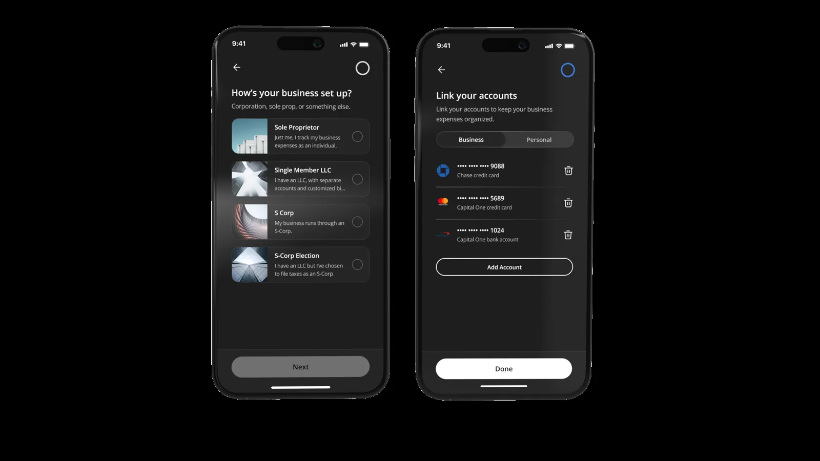
The Day 1 experience: why we chose friction
To validate our decision to front-load data collection, we compared the potential user states immediately post-signup. We prioritized speed to value over speed to entry.
Scenario A, the 'one click join' approach we discarded: the dashboard is skeletal, the cash flow widget flatlines, and the tax section shows a generic 'set up your entity' CTA. The user enters quickly but is immediately blocked by a cold start, because the platform lacks the context (fiscal year, S-Corp vs sole prop) to display anything meaningful.
Scenario B, the informed dashboard we implemented: because we collected entity type and fiscal year and linked the bank account, the tax projection is already visualizing their specific liability and the cash flow graph shows a live 12-month trend. The user lands in a personalized command center with no setup required. Higher upfront effort, but an immediate 'aha' moment and long-term retention.
Allaying user fear
Understanding taxes can be scary, so the aim was to build user confidence slowly and show how easy taxes can be to understand, with no surprises. A vital piece of this laid squarely on the dashboard experience. The dashboard as an aggregation of the user's entire experience is a powerful tool, but not as much as making it 'glanceable'. The aim was to help users understand their information within 5 seconds of viewing it.
With glanceable information as the priority, we helped users understand how much money they actually had by introducing cash flow, an aggregation of their remaining cash balance less taxes, expenses, and credit card balance.
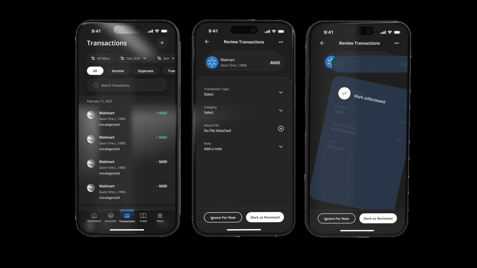
Gamifying the expense transactions flow
Reviewing transactions is historically the most tedious part of financial management. We aimed to change the mental model from 'data entry' to 'rapid review.' By leveraging AI to pre-categorize aggregated transactions with high accuracy, we simplified the interaction into a binary choice. Users simply swipe left or right to confirm or ignore the AI's suggestion, turning hours of line-by-line reconciliation into a fast, fluid workflow that clears the backlog in seconds.
We replaced traditional spreadsheets and dropdown menus with an AI-assisted card stack, letting users achieve 'inbox zero' on their finances with simple gestures. This pattern reduced cognitive load significantly, transforming a high-friction administrative task into a seamless, single-thumb interaction.
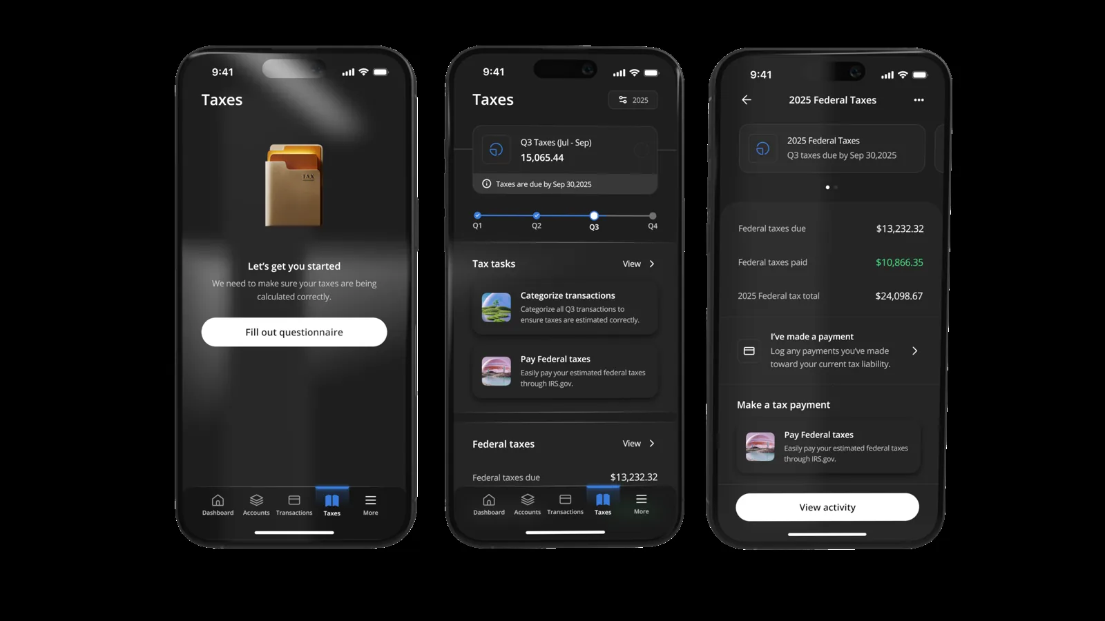
Making taxes effortless
The same rapid-review thinking carried into the Tax tab. Estimated quarterly liability is broken down clearly, with payment tracking, so the year-end surprise is replaced by a running, legible total the user can act on.
Iterate and simplify
Working with the Chief Wealth Officer was critical. There was a temptation to include complex investment forecasts in the MVP. However, applying the 'mobile first' constraint forced us to be ruthless.
We used the 'one thumb, one eye' principle: a user should be able to check their tax liability with one eye open, using one thumb, while standing in line for coffee. If a feature required a spreadsheet view, it was cut from the mobile MVP. This focus allowed the engineering team (four developers and a lead) to move rapidly, reusing logic from the web backend but serving it through a lightweight mobile frontend.
Reflection
Working with a smaller team means having to wear different hats, and my past experience working on multi-disciplinary teams was truly pivotal in helping dictate product strategy, prioritize features, and even weigh in on marketing strategy in order for this platform to find success.
As always, working on a whole new type of financial technology relies on acquiring new knowledge by studying US tax law and learning how best to position the platform to interpret it in a digestible way for our users.