Marriott Bonvoy
Building the loyalty experience for 160 million members.
I was tasked with migrating the entirety of Loyalty from the Aries platform to the new improved Phoenix platform. I took into account every single facet of the membership experience including integrating the mobile app in my decision making for consistency and a seamless experience across both platforms. Backed by over 15 rounds of UX research, I was able to successfully redefine nomenclature, content hierarchy, and overall usability across all loyalty specific experiences. These ranged from the My Account section which is specific to loyalty only to whole standalone experiences sprinkled across the entire Marriott experience.
The primary requirement was to enhance the hierarchy and visual design based on user research, while keeping the data points unchanged and not introducing any new functionality within the project scope.
To approach this, I started by closely examining the user research findings to understand where users are struggling with the current design and identify the key pain points related to hierarchy and visual design. Then I prioritized content to determine the most important elements that need to stand out based on the user research. Afterwards, I aimed to improve visual consistency across the entire interface, ensuring a clear visual hierarchy. Then I tested extensively on usertesting.com with different iterations to find the one that most resonated with our users.
Current state and the opportunities for improvement
The entirety of the loyalty experiences required a comprehensive revamp, but I was limited by the MVP scope, so part of the work involved improvements that would be pushed forward post MVP as 'MVP Plus'.
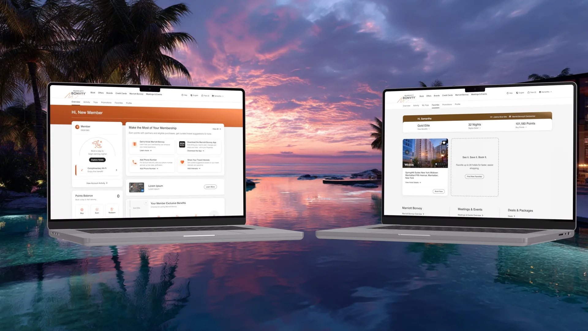
To narrow the focus of this case study, I'll concentrate on the tabbed My Account section, which is exclusive to signed-in users. This is the most critical aspect of the loyalty program, as it drives ongoing user engagement.
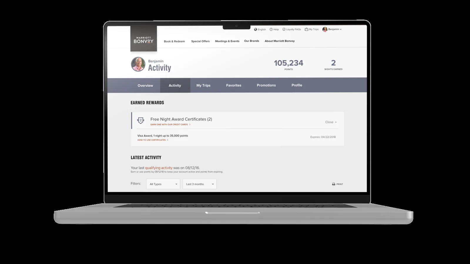
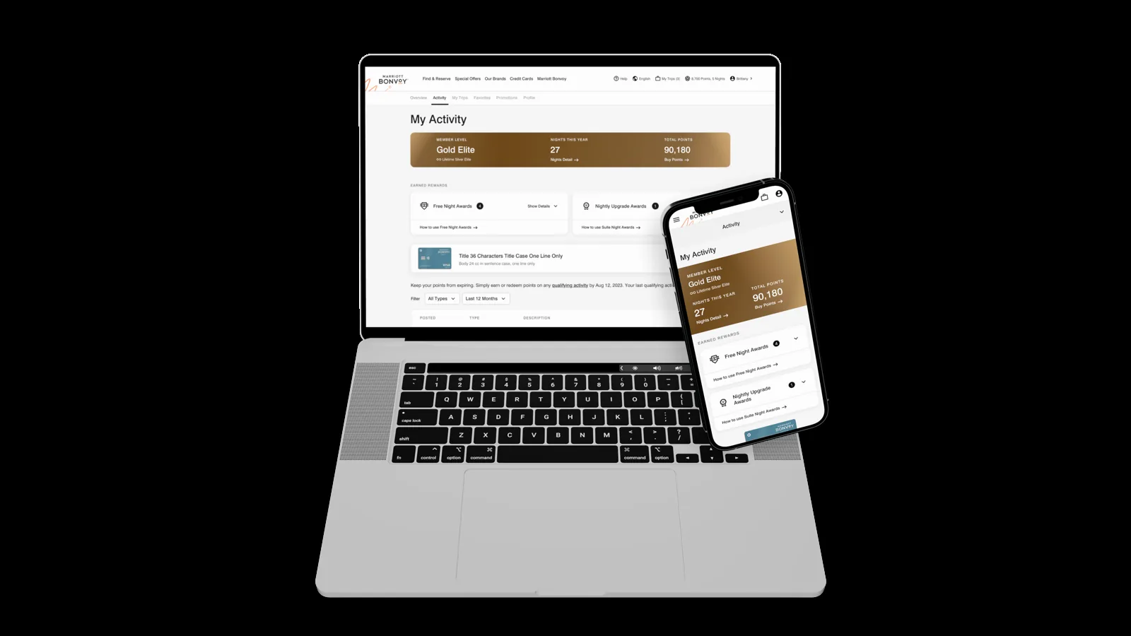
Activity and earned rewards
In this section, my priority was organizing information and establishing a clearer hierarchy. The goal was to make the content easy to understand while ensuring that the grouping of actions was intuitive and beneficial to the user. The aim wasn't to alter their understanding of the page but to enhance their experience by optimizing the information hierarchy.
- Research showed users found the information about their membership very useful so there was no need to rearrange the information, but there was room to improve the visual design to be more modern and reflect the member level color to improve tier identity.
- Users found this section useful but felt that it made more sense in the My Trips section. This improvement will be made post MVP as it isn't currently in scope.
- The 'Print Page' feature merely captures a screenshot of the current page, a functionality that users deemed unhelpful. This feedback presented an opportunity to consider deprecating this feature.
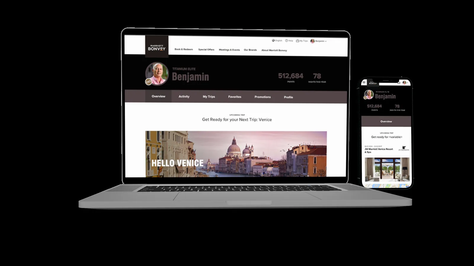
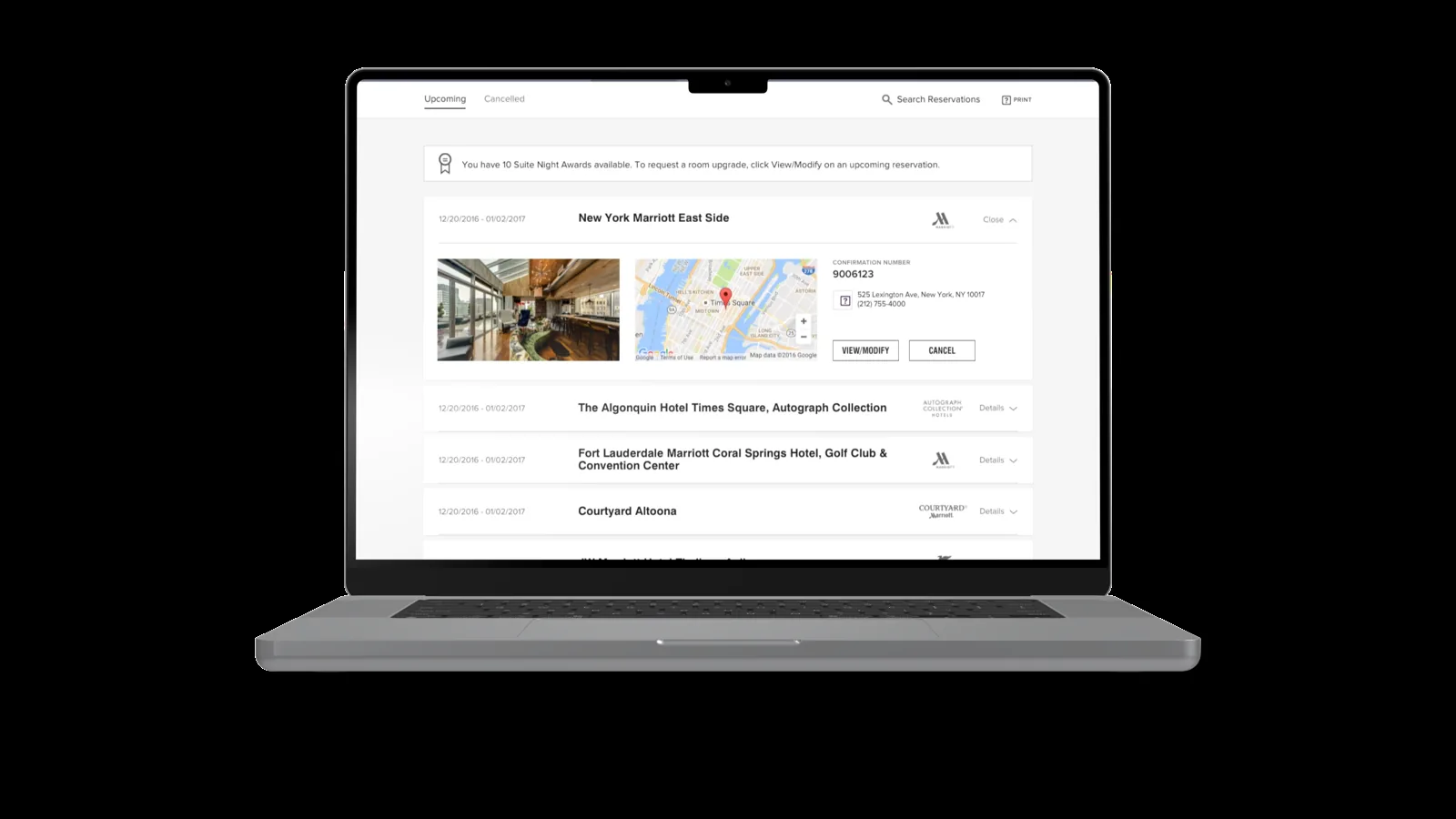
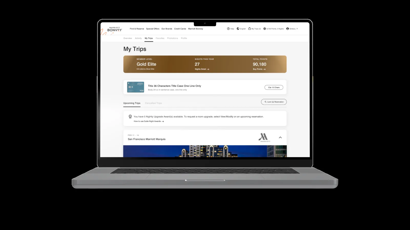
Upcoming and cancelled trips
This section contains the user's upcoming and cancelled trips. Research revealed significant opportunities for visual and hierarchical improvements, as users found the property card unappealing and lacking key information. Additionally, our business partners emphasized the importance of promoting secondary partners and activities to enhance the user experience at the properties upon arrival. This wouldn't involve adding new functionality, as it already exists on the card but was hidden in the code for unclear reasons.
- Research showed that users found the card layout confusing and did not think it prioritized the information they were looking for.
- The ability to collapse and expand the card was a functionality users found very useful so keeping this was vital.
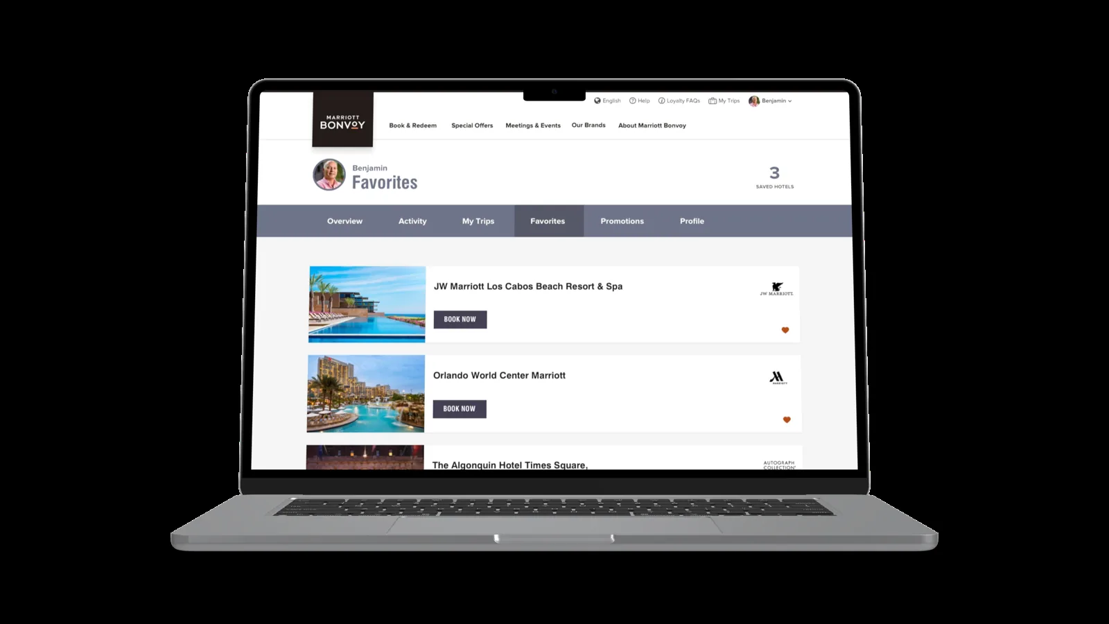
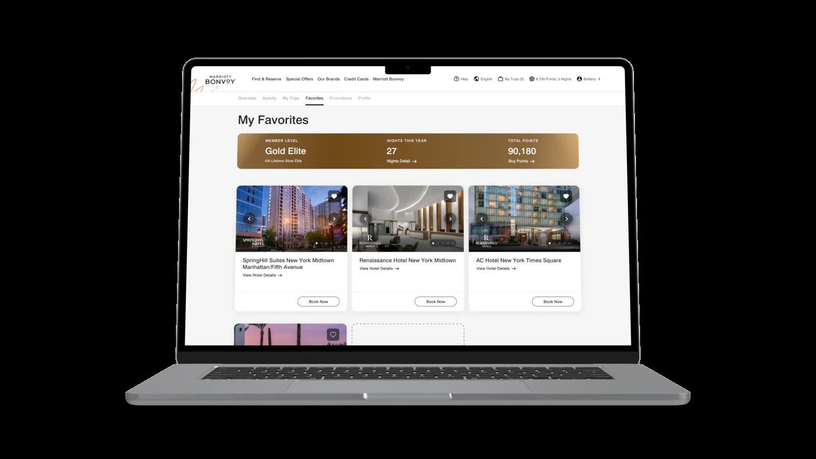
Favorites
The Favorites section, despite being the least interacted with among the My Account tabs according to metrics, received the most feedback during user research. It became evident that the lack of a visually engaging design and limited functionality led users to overlook this section. Users found the full-width cards overwhelming and felt that the cards could offer more features. Based on this feedback, we redesigned the section by switching from full-width cards to a three-card layout on desktop and incorporated a carousel scroll for property images. This allows users to explore properties directly on the page without needing to navigate to the property's individual page.
- This property card tested very poorly with users as it provided no additional functionality and they didn't find the design aesthetically pleasing.
- Research indicated that users would have preferred to see more cards at once, rather than scrolling through a long list to find additional properties.
Putting it all together in Overview
The Account Overview page serves as a comprehensive dashboard that consolidates all other pages within the My Account section. It presents users with essential information that highlights their journey and equips them with the most effective tools to enhance their membership experience. Research showed a myriad of areas for improvement:
- Page hierarchy: users found the page hierarchy confusing as it did not prioritize information relevant to their experience.
- The property card: it tested poorly as it elevated the city the property is located in instead of a photo of the property itself.
- Promotions: users found the progress bar useful but struggled to understand the progress and remaining requirements; the card was also too thin and constantly missed, often mistaken for the cobranded banner.
- Member snapshot: the most important information to the user was too far down the page, which caused frustration.
- Unclear sections: users occasionally felt uncertain about the grouping of certain items and believed a clearer callout would improve their experience.
- Favorites: the favorites card took up too much space and was inconsistent with how it is represented in the Favorites section.
- Offers: although rarely interacted with, it was a business requirement, so I focused on demonstrating value to boost engagement.
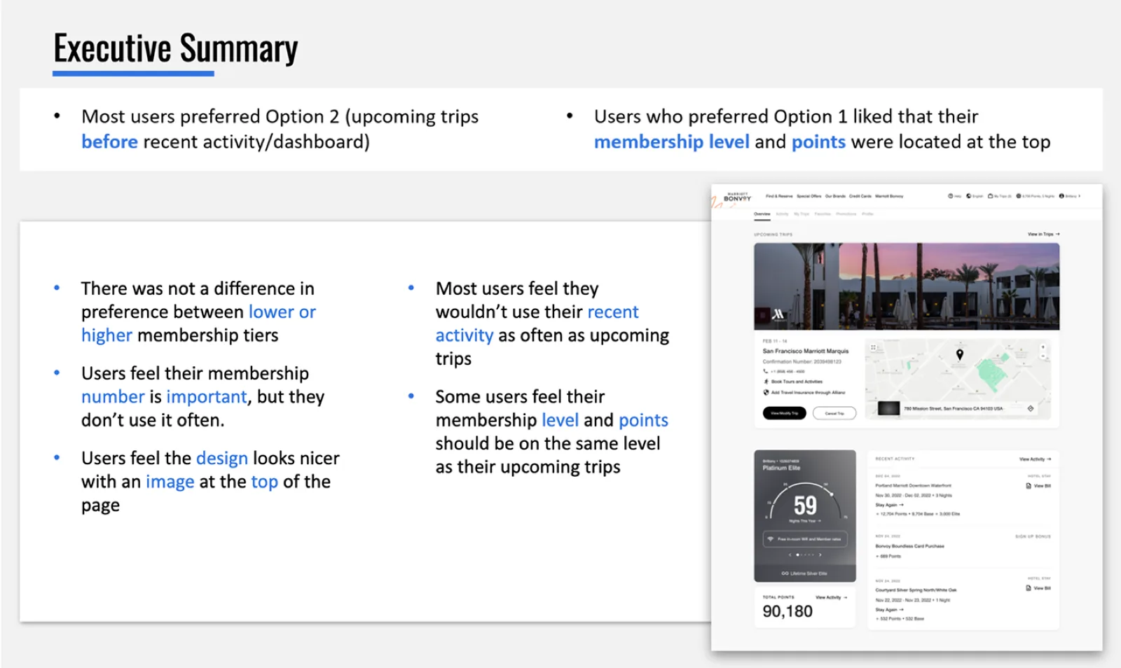
An attempt to address page hierarchy
On the Account Overview page, more than any other page, the hierarchy is most important as we have to prioritize the most important information for users. Getting this right was vital, as user conversion to stays was least significant on this page.
Next steps
Seeing as V1 was strictly migration from Aries to Phoenix, it left much to be desired in terms of features and, in general, aligning the platform with the future of travel and user acquisition. As such, shortly afterwards, we shifted gears to V2: a greatly improved user experience based on more in-depth user research and backed by a more intense market strategy.
Reflections
Given the project's strict policy against introducing new features, it became increasingly clear that collaboration among multi-disciplinary teams was essential. Managing scope creep required consistent effort from all team members. Acknowledging that this version may not achieve perfection allowed us to focus on potential future iterations.